Sunday, 28 August 2011

Life Form Concept Final

And the creature is finished! I am now one third of the way through the final concepts, and I'm very happy with the final outcome.

Fixing up a few problems I had with the silhouette (giving the back even more slope in particular) and focusing the weight into the feet-knuckle-things on Phil's advice. Also finally got the hind legs sorted, which I had neglected in favour of the forelegs, and figured the creature's back view out as well. After getting several opinions in favour of the hairiness I decided to go with it, and I sorted the face's front view (which had also been neglected).

 The final sketches for the turnaround, which, now I look back at them, could have had more weight going down the front, but it's a minor complaint.

More last-minute colour experimentation - I found some photographs of marshes and picked swatches from them to work with, though I eventually went back to the colour scheme of #3 from the previous batch. Light on land in marshes is often dappled as it passes through trees, so I bore this in mind as well as thinking that the dapples could double as faux-algae when submerged in water. #7 was the final design I chose, and #8-#12 were just playing with HSL and contrast sliders until I found something I liked. In the end I went with a combination of #9 and #11 - I liked the brown of #9 but toned it down with greens and greys from #11.

And the final turnaround! I am incredibly pleased with the final result, though if I ever have to draw dapples again I may just cry. The design has a very swampy feel, and looking back I'm glad I chose to give it fur. I was initially hesitant as it had always been hairless in my head, but the hair helps to break up the outline and make it look more real. In hindsight I feel I should have worked more on the face markings, so I'll remember that for the next time I do something like this. The fact that I focused on its shape from the side probably didn't help this, so I'll definitely have to get out of my everything-is-in-profile rut.

Also, after I finished I noticed just how much from the front its face looks like a Turian from Mass Effect. Oops.

Thursday, 25 August 2011

Life Form Concept Refinement Part 2

I settled on making it terrestrial, so here we go.

Trying to get a feel for how this creature would move - I referenced a lot of horses for the gait (thank goodness for Edweard Muybridge), because I felt like it would be more unusual for this thing to be agile rather than slow and lumbering like the legs suggest. Also experimenting with senses - I've decided that it won't have eyes, so it needs some other way of experiencing the world. The tendril-barbel-things looked too distracting, but I finally settled on a head shape while I was at it so it's not entirely a waste.

Applying the final head shape (which does actually have significant angles and curves, contrary to my original thinking). The body works better short rather than long, but I'm struggling to get the back to slope as much as I want it to. Still not sure about texture, I went forward with the furred one just to get things done but I keep looking back to the hairless one. I also finalised the way the legs work - yes, it's a stick diagram, but it does the job.

I went into Photoshop to mess with colours - which I'm not entirely sure I'm supposed to do, but what the hey. My favourites are currently #2, #3 and #8, but they've been changing all day so I'll sleep on it before making any actual decision.

Wednesday, 24 August 2011

Life Form Concept Refinement, Part 1

I settled on #20 to take forward, simply because of the legs. I'm quite un-focussed at the moment as I have lots of ideas for what I could do with the shape, but I can't seem to settle on one. Furthermore, this is your first introduction to my dreadful handwriting.

Starting with a larger sketch of the shape for reference, and playing with rotations and possible stretching of the shape. Nothing groundbreaking, just laying some foundations.

Here I'm beginning to think about habitat and locomotion - I noticed the legs could potentially be wings or flippers. I am very fond of the idea of the creature as being aquatic, but all my designs for it end up looking too much like typical plesiosaurs. I also began experimenting with the head shape - I feel like I should keep the head small and understated to draw attention to the limbs, and strong curves and angles definitely aren't working for that.

And investigating possible textures - thick, mammoth-like fur on a terrestrial creature was ruled out because it obscured the leg shapes too much. I also looked at possible fur for a marine creature - namely thick, dense fur like a sea otter's, hairlessness, walrus-like bristles or very short fur like a seal's. As I still haven't decided on whether I want the creature to be land- or seabound, I won't be making any decisions about that just yet.

More wrestling with the face, along with stumbling upon a possible idea for a 'crest' around the jaw echoing the leg shapes. Perhaps it could only appear on males, sort of like a deer's antlers. Also trying out potential body shapes for a waterborne creature, trying to break away from the typical sea-monster/plesiosaur. I'm not terribly fond of any of them, but they're a start.

Input would be much appreciated, even if it's only 'flip a coin, heads it's terrestrial, tails it's waterborne'.

Sunday, 21 August 2011

101 Sketches, Part the Fifth

Ladies and gentlemen, I am done. At least until tomorrow when I start working on the refined concepts. I have reached 101 sketches, so onto the next stage!

More silhouettes, some significantly sillier than others. None of these ones particularly appeal to me except #84 and #85. #84 strikes me as a very, very pompous apartment building, populated by the nouveau riche that have nothing better to do with their money than to spend it on a flat in one of the most architecturally ludicrous buildings they could find. #85 is a combination of the underground shaft and the lighthouse/beacon type thing from the last batch. Combining them didn't make either of them much stronger, but it's no weaker for it either. This probably means that the design itself is lacking, so probably not one to take further.

Here I played with other forms of structure than just accomodation - bridges, fountains, whatever the hell #95 is, etc. I'm especially pleased with #90, which started out as an excuse to use the high heel shape and conveniently happened at the same time I was pondering more efficient ways of getting spacecraft into orbit than using masses of fuel and creating so much noise that water has to be spread on the launch pad to muffle the noise that would otherwise damage sensitive equipment (and people's ears). The result? Industrial-strength slingshot. Whether it could get anything up to escape velocity is debatable, but it entertains me nonetheless.


You can tell that I'm running out of steam and grasping for ideas with this spread. All are fairly simple, and I will confess that that's because I was on the home stretch and wanted to get to that magical 101 quickly. Still, I do like #97 (though it taught me one very important thing - yes, you should look at your reference when you draw, but not so much that you don't look at the paper, only to look back and think 'what is this?!'). I don't know what it is, maybe some kind of fancy skyscraper, but if you ignore the dreadful linework it looks pretty. I also quite like #101, despite the fact that I rushed it. I plucked a couple of shapes at random and combined them, and they actually complement each other nicely.

Thursday, 18 August 2011

101 Sketches, Part the Fourth

 81 done, 20 to go! Finally finished the machines, now onto the structures.

These ones are just playing with the designs on the previous page and seeing what I could do with them. I quite like #55, the most overwrought elevator ever. #56 looks somewhat goofy, what with the in-line wheels and exhaust pipes that suggest the driver is compensating for something, but oh well.

I think it is a legal requirement in some places that anyone doing concept art must at some point design some manner of airship. That said, #63 is a long way from my favourite of this spread - it looks like a very odd zeppelin, though it could go places with some modification. My actual favourite is #61, yet another I-have-no-idea-what-it-does contraption. My best guess would be some kind of machine for mixing fluids, but my guess is as good as yours.

#67 is probably my favourite of all the machine designs, simply for the 'sails'. I am tempted to combine it with #63 to create a very fancy airship. The structures on the right-hand page could be better, none of them have an obvious function (except #71, which appears to be a belltower), and the shapes aren't especially interesting.

I appear to have stuffed up my numbering here (there are two #71s), which would explain why it got so confusing from this point onwards. That said, the second #71 is one of the more interesting ones of this spread, particularly the fire I slapped on at the end to turn it into some kind of beacon. Maybe a fantasy lighthouse? I'm also fond of #78, where I thought 'why should all these structures be above-ground?'.


And finally a handful of silhouettes, more playing with possible shapes than actually designing structures. None of them appeal to me much right now, but they could become useful base shapes for further designs.

Sunday, 14 August 2011

101 Sketches, Part the Third

A few repeats in this one as I had some spaces on existing spreads, so forgive me for that. Not as many sketches here as I would like, but I am now over halfway through!

I finished up this spread, and I'm feeling quite ambiguous as to whether I like it. I like #16, as I've never tried designing a small midge-sized insect before and I think it came out quite well. #17 I have a real love-hate relationship with as you have to look really hard to get any sense of it being a creature, but once you do it does actually look all right, even if I can't figure out which end's the front. I like the idea of a massive head or abdomen being pushed or dragged by two stubby legs, it's kind of cute in a miserable, pathetic way.


You've seen most of these, but I've added #19 and #20 so you can see them again. I'm quite pleased with #20 - the legs are definitely the most interesting part of the design, so I kept the rest of it fairly plain to make the legs the main event. #19 just sort of happened, and I'm not sure if I like it. I do like the crest-fan-thingy around its head, but beyond that I'm not particularly interested in it.

And back to machines. I'm actually quite pleased with these ones, especially #51 and #52. #51 could be some kind of cargo hauler, while I have no idea what #52 is and yet I'm okay with this. #53 was kind of improvised, I lay down the shape, realised it looked nothing like a machine and just decided 'stuff it, it's a ski lift'.

Tuesday, 9 August 2011

101 Sketches, Part the Second

First and foremost, thank you everyone for helping put a neurotic fresher's mind at ease! I don't feel anywhere near as terrified now, so, with that said, here is today's batch of sketches. Also, apologies for the haphazard numbering, I'm left-handed so I work across the page right-to-left (most of the time - other times I just go all over the page).


I went back to creatures to try out some of the suggestions I was given - I'm a very one-thing-at-a-time sort, and when I try new techniques it helps to have something familiar to attach them too. Probably the most successful example of the overlaying technique is #1, even though I have no idea what it is.


As well as a couple of oddities I began playing with silhouettes - they were definitely very helpful, and incredibly quick to do! I found I didn't have to worry about which bits were what and instead just tried to make interesting shapes. The conjoined legs on #8 were actually from a shar pei dog (the ones with far too much skin) I saw while drawing it, and I really liked the way the skin flopped everywhere, so I went with it.


And two more, for luck. I really like the head-shape of #12, it's like it can't decide if it wants to be a reptile or an insect. #13 contains about half a dozen indvidual shapes but you can't really tell - I'm not sure if this is a good thing in that it gives a sense of cohesion to the silhouette, or a bad thing in that it feels to homogenous.

Sunday, 7 August 2011

101 Sketches, Part the First

Before I show these sketches, I'll say that I am terrified of showing them. I am very self-conscious about my sketches, and ordinarily once they're done I will work from them and then consign them to a box never to look at them again. So showcasing them here is very very scary for me, especially as I feel like I'm dancing around shouting 'Look, world! Look at everything I don't know about concept art!' With that said, here goes nothing.


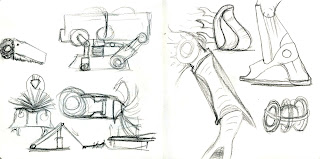
The first thing you will notice is the big blank spaces - that's because I did a few sketches that drew shapes from things other than the object sheets, which I removed when I found out that we had to use only the sheets. These ones I quite like, especially the little bird-slug-thing down in the corner. He's kind of cute.


The second thing you will notice is that I am terrible about sticking within my canvas. This isn't bad cropping, it's bad planning on my part.  I really really like the frilled, strange-mouthed critter in the lower left corner - I am sorely tempted to take that one further.


Ah, machinery, my mortal enemy. The only one of this batch I actually like is the caterpillar train, which is just so silly and impractical I have to love it. The rest are boring, idiotic and unoriginal. I hated drawing every one of these because I struggled so much to think of ways to make machines from the shapes, and it shows.


I hate drawing machines - they don't make sense to me. I am insane about getting details correct, and my lack of knowledge of (and, admittedly, interest in) machines makes it very difficult to design them. By some stroke of luck my brother is a mechanical engineer, so I went to him for advice and he gave me this working definition of a machine;

'A machine is anything that converts energy into motion or produces the energy to do so. They either perform tasks humans cannot do or do tasks humans can do but more efficiently.'

My problem with machines was that I didn't really know exactly what they were - I could point to one and say 'that's a machine all right', but I didn't understand precisely what they were for. The next problem will be actually designing machines that don't look dreadful, but I'll manage.