Saturday, 31 December 2011

Thumbnails, Thumbnails

After faffing with the kitchen-come-field-hospital idea somewhat I found that it just wasn't working, so I looked back at the idea of the lone surviving, intact building surrounded by desolation. I looked at photos from the Blitz as reference, particularly this one;

Apologies for the ugly watermark, couldn't find a copy without it.


Working quicker this time (the previous batch took stupidly long), I started to play with potential settings other than 'generic road #362'. #19 I quite like, but it doesn't feel uncanny enough. Similarly #20 is a decent enough idea - nature overtaking a ruined back garden - but again, lacks uncanniness. #22 was an a-ha moment - I needed a living element involved to make it seem less like just a delipidated old town. The horse tracks (I can hear the groaning from here) were actually consciously chosen for reasons other than 'yay ponies' - it could either be a horse and rider, or just a feral horse passing through. #25 isn't as strong, the twisted trees just make it seem cluttered.

Thursday, 15 December 2011

Space Maya


This is the reason I've not been terribly active on this blog lately. It's unfinished, but it needs to be submitted so submitted it shall be. I struggled greatly with this, particularly the UV mapping, and in hindsight I should have sought more help than I did.

Space Disc Artwork

James Cameron's Avatar (2009)


Fig. 1. Avatar poster.

Avatar is a visual feast and a narrative famine. Its plot can be summarised as ‘Pocahontas in space’, so this review will focus largely on the production design with occasional narrative references where necessary.

The film’s setting, a moon called Pandora, is lush and diverse in animal and plant life. Among these are the Na’Vi, a humanoid, sentient species that is being oppressed by humans seeking to strip mine the moon for a mineral called ‘unobtainium’. The first thing one notices about Pandora is that it is largely blue – the Na’Vi are blue, many of the plants are blue or blue-green, and after dark the Pandora rainforest lights up with blue and pink bioluminescence. This heavy use of blue makes the setting seem more alien; blue is very rarely encountered in nature on Earth, even less so in such vast areas of plant life. Unfortunately, this diversity is somewhat limited in its imagination; “What the film doesn't offer is any real imaginative leap. Think of any fiction set in a fantasy Eden, and you're likely to have dragon-like dinosaurs, massive awe-inspiring trees, the odd bizarre insect. They're all here, but rarely to surprising effect.” (Romney, 2009).

 Fig. 2. I'kran close-up.

Pandora is presented as a paradise, particularly the Na’Vi culture which reveres nature and abhors unnecessary death. The Na’Vi are shown as infinitely more wise than humans in being abel to communicate with nature and the film is utterly unsubtle in reminding us that, bar a few exceptions, humans are murderous savages compared to these bastions of morality – “There’s never any doubt that Cameron considers the Na’vi to be more human – freer of spirit and emotion, more connected to the world around them” (Hewitt, 2009).

In regards to the Na’Vi, they walk the line between being human and animal. They embody both the wisdom of humanity and the purity of nature, and in doing so are suggested to transcend both. The use of cat-like features, especially in the face, tail and stance, implies grace and cunning, while the braid (a protrusion which effectively acts as a neural USB jack allowing the control of animals, raising the question of whether the Na’Vi subjugate nature just as much as the humans, only in a different way) is reminiscent of popular conceptions of Native Americans. The clothing, as well, is incredibly Native American, which serves to both make the Na’Vi familiar and jolt the viewer out of their suspension of disbelief – ‘why do these aliens, on a faraway planet with little to no knowledge of human culture, and which evolved completely separately, look so human?’.

The emphasis on making the Na’Vi humanlike has an unfortunate side-effect. All the creatures on Pandora except the Na’Vi have six limbs, whereas the Na’Vi only have four. In the wealth of supplemental material this is rationalised as the two upper limbs fusing, but this explanation is unsatisfying. For a species as arboreal as the Na’Vi, four grasping limbs would be nothing but an advantage. Instead, this is a clear attempt to humanise the Na’Vi regardless of the logic of doing so.

Fig. 3. Jake & Neytiri.

In contrast, the sharp angles and constant presence of heavy industry in the human-held areas of Pandora are jarring after the beauty and peace of the forest, a fact used to make the viewer resent the humans for encroaching upon it. In fact, apart from a single irascible warrior, the film never shows any of the unpleasant sides of Na’Vi life, and in doing so implies that there aren’t any.

This black-and-white thinking shows through in the production design, presenting the Na’Vi as beautiful and flawless, one with nature, while showing humanity as part of a violent, smoke-spewing machine bent only on personal gain and the destruction of anything that opposes it. “It’s an achievement to make 3D look as good as it does here, but that counts for little if the characters are all in 1D. The film is a triumph of effects over affect. “ (Sandhu, 2009)

Illustration List
Cameron, J. (2009). Fig. 1. Avatar poster. http://storageeffect.media.seagate.com/files/2010/03/avatar-movie-poster.jpg (Accessed on 14/12/11) 
Cameron, J. (2009). Fig. 2. I'kran close-up. http://www.iwatchstuff.com/2010/02/03/avatar-beast.jpg (Accessed on 14/12/11)  
Cameron, J. (2009). Fig. 3. Jake & Neytiri. http://fcdn.filmonic.netdna-cdn.com/wp-content/uploads/2009/10/avatar-still.jpg (Accessed on 14/12/11)  

Bibliography
Hewitt, C. (2009) Empire Magazine. http://www.empireonline.com/reviews/reviewcomplete.asp?FID=133552 (Accessed on 14/12/11)
Romney, J. (2009). The Independent. http://www.independent.co.uk/arts-entertainment/films/reviews/avatar-james-cameron-163-mins-pg-1845569.html
Sandhu, S. (2009). The Telegraph. (Accessed on 14/12/11) http://www.telegraph.co.uk/culture/film/filmreviews/6832593/Avatar-full-review.html  (Accessed on 14/12/11)

Tim Burton's Edward Scissorhands (1990)


Fig. 1. Edward Scissorhands poster.

Edward Scissorhands is a film about contrast. Burton presents the apparently safe, pastel-coloured suburbia as housing dangerous, cruel inhabitants, while the eerie Gothic castle in which Edward is found becomes a place of refuge – “It is unlike any other home in the town, and it clearly is a place to be avoided. It exudes darkness and isolation. Yet, in a Tim Burton world nothing is untouchable and no place is unreachable” (Propes, unknown). The protagonist, the eponymous Edward, finds himself caught up in the politics and vindictiveness of the suburbs, initially relishing the company but eventually rejecting it for its rejection of him.

Fig. 2. Castle shot.

Edward is the most immediately noticeable aspect of design in the film; clad in skin-tight leather, with impossibly pale skin, a shock of dark hair and deep black bags under his eyes (making him reminiscent of Cesare from The Cabinet of Dr. Caligari) and of course the iconic blades for hands. All this is used to make him seem ‘other’, and yet over the course of the film the viewer comes to trust the visually threatening Edward more than the apparently safe citizens of the town.

The film is distinctly autobiographical on Burton’s part; the concept of a well-meaning yet inherently ‘different’ individual being exploited then eventually driven away from society when their talents became threatening is a powerful one. It is easy to identify with Edward, even though he is physically unlike anything one would see in reality; “On one level, [the film is] about handicap: Edward is both handicapped and "special", like an autistic child with miraculous drawing ability. Edward also represents the artist, tolerated and celebrated by "normal" people - but only as long as he is not unduly threatening.” (Tookey, 2009).

 Fig. 3. Edward & Kim.

There is a constant presence of topiaries throughout the film, creating whimsical yet unsettling silhouettes. This further serves to highlight Edward’s nature as highly skilled but unnerving at the same time. Initially the topiaries are playful, but as the film progresses and there are more and more night shots the topiaries create eerie shapes in the gloom as the people of the town turn against Edward.

In contrast, the castle initially seems dangerous, but its association with Edward, and its role as a haven from the rest of the town, eventually make it seem more welcoming, regardless of the cobwebs, dust and perilous-looking floorboards; “The sickly sweet colours of the town perfectly contrast the wintery hues of the gothic mansion high up on the hill and the snow-spray which falls from Edward’s ice sculptures reminds the jaded townspeople (and the audience) of the innocence they have lost by touching them with his own” (Gilbert, unknown). In fact, in the climax of the film when we see the castle’s gardens fallen into disrepair due to Edward’s absence, the viewer feels a distinct pang of regret that Edward ever left.

Illustration List
Burton, T. (1990)  Fig. 1. Edward Scissorhands poster. http://www.moviegoods.com/Assets/product_images/1020/470389.1020.A.jpg (Accessed on 14/12/11)
Burton, T. (1990)  Fig. 2. Castle shot. http://www.hdwarez.com/poster/edward-scissorhands/4j6o04.png (Accessed on 14/12/11)
Burton, T. (1990)  Fig. 3. Edward & Kim. http://200movies1woman.com/wp-content/uploads/2010/09/edward_scissorhands12.jpg (Accessed on 14/12/11)

Bibliography
Gilbert, J. (unknown). Thatfilmguy.co.uk. http://www.thatfilmguy.co.uk/edward-scissorhands-1990 (Accessed on 14/12/11)
Propes, R. (unknown). The Independent Critic. http://www.theindependentcritic.com/edward_scissorhands (Accessed on 14/12/11)
Tookey, C. (2009) Chris Tookey’s Movie Film Review. http://www.movie-film-review.com/devfilm.asp?id=3954 (Accessed on 14/12/11)

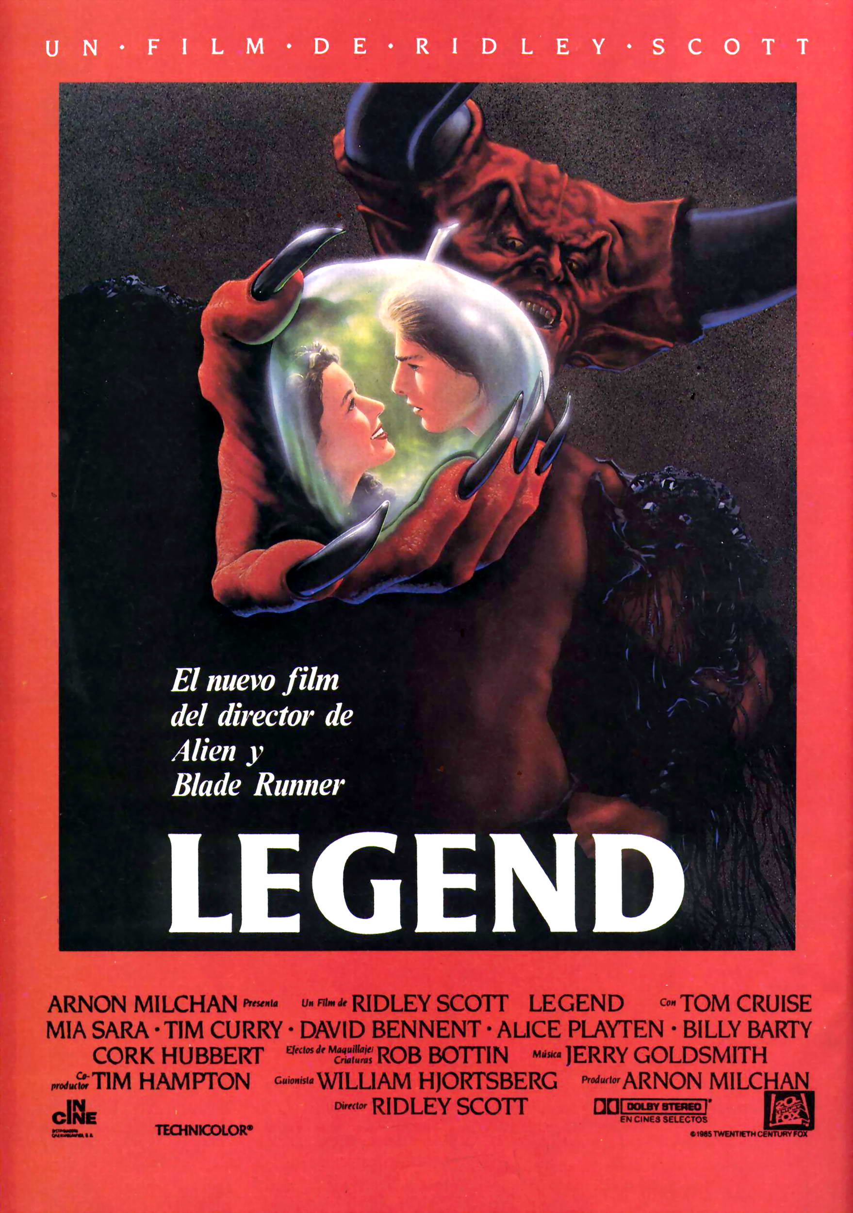
Ridley Scott's Legend (1985)

Fig. 1. Legend poster

Legend is a highly theatrical film. While somewhat lacking in the plot department, the film provides sumptuous visuals. “The film is impossibly beautiful. The entire movie was shot inside a studio, with all of the exterior forest scenes recreated indoors for maximum visual control.” (Bacchus, 2011). With this much control over the visuals, shots are composed extremely strongly; the rule of thirds is everywhere, and any individual still could be a carefully composed photograph.

Fig. 2. Darkness mid-shot.

Perhaps the most distinctive visual element of Legend is that of Darkness, the main villain; Tim Curry is smothered in makeup to make him into a red, angry demonic figure with impossibly huge horns. In fact, Curry’s makeup is a reasonable metaphor for the entire film; conceptually not all that different from existing ideas and clichés, but made larger-than-life. Assheton Gorton, the film’s production designer, “created a series of fancy, plastic sets that keep the eye busier than the mind or the heart. When he runs out of dandelion fluff, he fills the air with cherry blossom petals and, later, with snow so fine and glisteny it looks to be sugar, plus 1,500 icicles made of resin and hot wax.” (Canby, 1986).

The film uses simple folkloric concepts, but “seems to be set less in the land of the Brothers Grimm than in some kind of cinematic limbo, where characters have neither purity to be simple archetypes nor the depth to be truly believable.” (Biodrowski, 2009). The film’s occasional attempts to look at the darker side of fairy tales are stillborn and, due to the gorgeous, idyllic, perfectly controlled nature of the sets, somewhat out of place. The precision with which everything is designed lends an air of artificiality to the film, which removes the possibility of the wildness and uncontrollability that a darker film would thrive on.

Fig. 3. Lily & Jack.

Legend has overtones of a virgin-whore complex; that is, the idea that a woman is only ‘good’ when she is pure and chaste, and that the slightest element of sexuality makes a woman a whore. Darkness, the villain of the piece, attempts to seduce Lily, placing her in a dark, revealing costume in contrast to her virginal white dress. Furthermore, Oona’s active rather than passive desire for Jack makes her catty and unhelpful, further suggesting that female sexuality is dangerous.

Illustration List
Scott, R. (1985) Fig. 1. Legend poster.  (Accessed on 14/12/11) 
Scott, R. (1985) Fig. 2. Darkness mid-shot. https://blogger.googleusercontent.com/img/b/R29vZ2xl/AVvXsEjUPpFKxm9mHOOZgV0BNeHcp-8v9rZ21vwRvwSwMK-a-aP9PU2D6Gf-ij1zjCgxY6aUOPQBpA662ADwcP3IXlEkYuYzdbckHAyZMoUHu85EiBkHOougnRJvz1n0bM6CXMW1WgT4WTUDrtg/s1600/Legend_13.jpg  (Accessed on 14/12/11)
Scott, R. (1985) Fig. 3. Lily & Jack. http://www.multi-story.org/podcasts/films/legend_l.jpg  (Accessed on 14/12/11)

Bibliography
Bacchus, A. (2011). Daily Film Dose. http://www.dailyfilmdose.com/2011/07/legend.html (Accessed on 14/12/11)
Biodrowski, S. (2009). Cinefantastique. http://cinefantastiqueonline.com/2009/05/legend-1985-retrospective-film-dvd-review/ (Accessed on 14/12/11)
Canby, V. (1986). The New York Times. http://movies.nytimes.com/movie/review?res=9A0DE2DC1E38F93BA25757C0A960948260 (Accessed on 14/12/11)

Cooper & Schoedsacker's King Kong (1933)


 Fig. 1. King Kong poster

King Kong is ultimately a film about contrast. It takes a very naïve look at duality; the natives of Skull Island are backwards and degenerate compared to the ‘civilised’ white folk, the female lead, Anne, is helpless compared to her male counterparts, and Kong goes from being the god of a pre-industrial people to a curiosity for post-industrial Manhattan.

 Fig. 2. Kong close-up

Perhaps the fall of Kong is a metaphor for industry’s destruction of nature; perhaps it is a euphemism for the widely held idea at the time of black people being a ‘lesser’ race. Looking back it is impossible not to cringe at the unashamed racism, but at the time this, and the now-blatant sexism, were commonplace – in fact, it is noted in reviews at the time that the female lead is surprising for not fainting – “It often seems as though Ann Redman, who goes through more terror than any of the other characters in the film, would faint, but she always appears to be able to scream” (Hall, 1933). In terms of narrative it is nothing special, but the film paced the way for modern special effects; “While King Kong is not hailed as a classic of narrative film, it was the one picture that made way, carved the path, for all modern day blockbusters.” (Breese, 2004).

Created at the peak of the Great Depression, King Kong’s primary purpose was escapism. People would come to the cinema to escape, however briefly, from their poverty and misery. The presence of fashionable, formally-dressed people at the unveiling of Kong to the western world are reminiscent of celebrity culture – showing people what they don’t have so they may live vicariously through those that do.

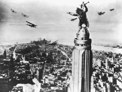
Fig. 3. Kong atop the Empire State Building.

While it could no doubt have benefited from the advice of a taxidermist or anatomist with experience of gorillas, the film revolutionized special effects. It pioneered the concept of foreground, mid-ground and background in cinema seemingly unintentionally – Kong is almost always on a different plane than the actors, due to the fact that he was animated and filmed separately and then projected onto a screen behind the actors. It is tempting to look at the film through contemporary eyes, but it “defies such limited expectations because it was so ahead of its time.” (Haflidason, 2001)

Illustration List
Cooper, M. & Schoedsack, E. Fig. 1. King Kong poster. https://blogger.googleusercontent.com/img/b/R29vZ2xl/AVvXsEg_TL0HNpm2Z_EtFGyxbKh-380YWR3ALQXzo_0eq_X_zhl5-Np9meI0bKI4bv_tJAEK9UW9Y0kDTV-meFzl00_1FE_amnRGnh9keu7l75Bb7OzqCuf83VeDaxxcN6ponDUxNrCz2TzH3yXs/s1600/king+kong+movie+poster+2.jpg (Accessed on 14/12/11)
Cooper, M. & Schoedsack, E. Fig. 2. Kong close-up. https://blogger.googleusercontent.com/img/b/R29vZ2xl/AVvXsEiW3WQlDzc9sLl81p2jhwS1e13mhypA9I-XR9_KHvd2SZSDrTu5WkpFnUo1FWw10INw0jRnttfd_iHDAViipUIMs4E2U8BpFbt5OrPsu1bHTsfYxOLQulZa9HD3GhWBWF_lYCMg7J2FcgBX/s400/king+kong+4.jpg (Accessed on 14/12/11)
Cooper, M. & Schoedsack, E. Fig. 3. Kong atop the Empire State Building. http://www.filmreference.com/images/sjff_01_img0269.jpg (Accessed on 14/12/11)

Bibliography
Breese, K. (2004). Filmcritic.com http://www.filmcritic.com/reviews/1933/king-kong/ (Accessed on 14/12/11)
Haflidason, A. (2001). BBC Movies. http://www.bbc.co.uk/films/2001/01/30/king_kong_1933_review.shtml (Accessed on 14/12/11)
Hall, M. (1933). The New York Times. http://movies.nytimes.com/movie/review?res=9F03E3DC173BEF3ABC4B53DFB5668388629EDE (Accessed on 14/12/11)