Friday, 25 November 2011
A Whole Lot of Things
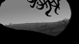
These three are depth-of-field tests, to try and get my head around semi-realistic DOF before applying it to anything heavily stylised. Very quick and loose, value was more important than detail here.
Another super super quick thing that isn't even finished but may be going somewhere. I still like the bright-colour-on-black concept, but here it looks overdone and rather flat, so that'll take some fixing.
And taking the purple-and-orange forest thumbnail from the last batch forward somewhat to see how it would go. Pattern-wise it looks great, but compositionally not so much. It's all over the place, and there's no sense of depth.
Photoshop Phil gave me some suggestions as to how I could make the previous study more depth-y by using layers and volumetric fog. It definitely recedes into the distance now, but I think it looks to cut-out, so I'll need to find a happy medium.
This one was an experiment in zooming out - the original sketch consisted of the upper right quarter of this image, which I then shrunk, tucked into the corner, worked back into, shrunk again and repeated. I really needed to zoom out with my work - I was using what Tutor Phil called the 'Kodak angle' and working too close to my subject. Zooming out further wouldn't hurt this piece, but it's still infinitely better than the very, very close-in compositions I was using.
And some thumbnails done quickly after the crit and seeing everyone else's approach to this. I particularly noticed the emphasis on lighting people had, and Phil mentioned that in concept art lighting that doesn't make sense but serves a purpose is okay. I tried working some shafts of light through cracks in the wall into the tunnel, and looked at Art Nouveau compositions for ideas for the pillars. The circular one in the conrer is based on the common circle motif, but out of context it looks somewhat unfortunate.
Subscribe to:
Post Comments (Atom)


Hey Meg - I very much like Fig 6 from the top - with the clear layers - but it does feel as if you need to put some taller elements in the background to lend dynamism to the composition. Good to read that you're drinking in some of the more general feedback at today's crit. I look forward to seeing some more updates on here soon! :)
ReplyDelete