Monday, 19 September 2011

Kurt Neumann's The Fly (1958)

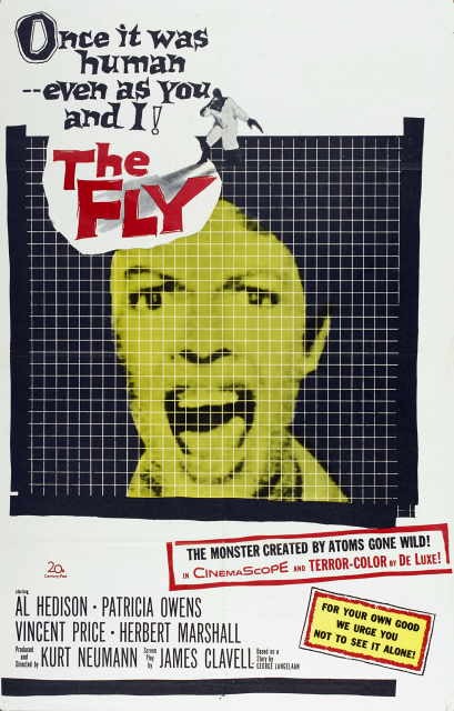
Fig. 1 The Fly Poster.

The 1958 film The Fly directed by Kurt Neumann tells the story of the accidental merging of human and fly atoms through a teleportation device, couched in a murder mystery. The transformation of human into a fly-headed and -armed creature as a direct result of carelessness and meddling in the realm of the gods harkens back to Greek mythology, in which proud humans were punished by being made into animals.

Fig. 2 Andre-Fly shot.

 The concept of ‘karmic’ retribution for seeking to elevate oneself or humanity as a whole over a deity is one echoed in much science fiction, perhaps most notably Mary Shelley’s Frankenstein. The Fly in particular refers to contemporary fears of the rapid development of technology, and touches on the idea that ‘the road to hell is paved with good intentions’. However, the movie is adamant that Andre, the unfortunate scientist, was still right to pursue his course of action, as it describes him ‘as an explorer like Columbus, who sacrificed himself for the sake of discovering something that would benefit future generations’ (Biodrowski, 2007).

The movie contrasts Andre’s unpleasant fate to the idyllic home life of Andre and his wife Helene (Patricia Owens). The husband-and-wife relationship is set up as loving and devoted long before the accident even happens, investing the viewer in them and thus making the eventual transformation and mercy killing all the more dreadful. Howard Thompson noted that ‘most appealing of all, however, is the compassion blended in with the suspense when something terrible happens in Mr. Hedison's basement laboratory.’ (Thompson, 1958), explaining perfectly the appeal of the movie.

Andre-Fly and Helene shot.

Rather than a simple monster flick, The Fly looks at what it means to be human, and at what point a transformed monster ceases to be human. Even as Andre’s mind begins to degenerate into that of a fly, Helene remains faithful to him and desperately tries to help him until she finally sees what has actually become of her husband, by which point it is clear to both her and the viewer that death is preferable to a hybrid, mindless existence.

Except for at the very beginning there is little gore in the film – Andre’s transformation is shown off-screen to facilitate a later reveal – as the focus is more on the ‘a profound horror in the psychological implications of a tragic series of events’ (Sponseller, 2001). Not only is Andre deeply ashamed of his metamorphosed body, but the metamorphosis has a profound impact on his psyche, slowly destroying his human cognition. In the end Andre chooses to die rather than to become a monster, a painfully human act in stark contract with the physical beast he had become.

List of Illustrations
Figure 1. Neumann, Kurt (1958) The Fly Poster. At: http://classic-horror.com/files/images/fly_1958_poster.jpg (Accessed on 19/09/11)
Figure 2. Andre-Fly shot. (1958) From: The Fly Directed by: Kurt Neumann. [film still] USA: 20th Century Fox
Figure 3. Andre-Fly and Helene shot. (1958) From: The Fly Directed by: Kurt Neumann. [film still] USA: 20th Century Fox

Bibliography
Biodrowski, S. (2007) Cinefantastique Online. http://cinefantastiqueonline.com/2007/08/retrospective-the-fly/ (Accessed on 19/09/11)
 (Accessed on 19/09/11)
Thompson, H. (1958) The Screen: Hair-Raiser; ‘The Fly' Is New Bill at Local Theatres In: The New York Times. [online] http://movies.nytimes.com/movie/review?res=9502E4DA1031E73BBC4850DFBE668383649EDE  (Accessed on 19/09/11)
Sponseller, B. (2001) Classic Horror. http://classic-horror.com/reviews/fly_1958  (Accessed on 19/09/11)

Sunday, 18 September 2011

Metamorphosis, or why you should not share a teleporter with a shark

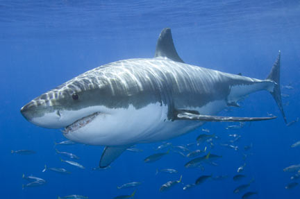
Ladies and gentlemen, I will be the first to say that I was thrilled when I disovered the CG Arts and Animation department had their very own teleporter, and rushed to try it out. Unfortunately, there has been a slight mishap. One of my particularly clumsy colleagues (you know who you are) rushed into the room as I was teleporting, brandishing a very large example of Carcharodon carcharias, better known as the great white shark. This is a transcript of what transpired drawn from security footage.

Colleague: Dude, check out this sick shark!
Me: Where the hell did you get that?
Colleague: Bought it at a car boot sa-AAAARRRRGGGHHHHHH
[Colleague trips, sending the shark flying into the teleporter as it activates]
[REDACTED DUE TO UNACCEPTABLE PROFANITY]

As a result, my very genes have been combined with those of the shark. In light of my situation, which appears to be rather common among freshers, I have researched the shark to better understand my other half, as it were. As it seems most of my colleagues have undergone a similar fate, the tutors have decided to make the best of the situation and assign a comparitive anatomy project based on it.


Rather like myself, the great white shark is often blamed for a lot of trouble it doesn't actually cause. Widely regarded as a man-eater courtesy of the movie Jaws, there have only been 249 unprovoked great white attacks since records began. To put this in context, there have been a total of 2320 unprovoked shark attacks worldwide. They are surprisingly curious and try to identify strange objects. Unfortunately their main way of doing this is with their teeth, which is the reason for most attacks on humans.

Also like myself, great whites tend to look like murderous psychopaths when they 'smile'. 

The great white is best known for its teeth, which constantly wear out and are replaced. HowStuffWorks.com says they have 3000 teeth, but I'm unconvinced so I'm taking it with a grain of salt. Adults weigh in at around 680-1100kgs (1500-2400lbs) (HowStuffWorks claims they can come in at 2000kgs/4500lbs - still not convinced) and the females (which are generally larger than the males) can grow up to 5m (16') long, making them the largest predatory fish alive.


I, on the other hand, am 5'4", bespectacled and mostly harmless. Let's see how this turns out.

Sunday, 11 September 2011

Structure Concept Final

'Twas the night before uni', and all through the air came the screams of a fresher tearing out all her hair.

I am so glad this piece is done. Sketching and fleshing the design out was great fun - the final turnaround, not so much. I may fiddle with it more on Wednesday or Thursday, but for now I am going to wash my hands of this.

Just finalising the shape and the bowl design. I went back to my earlier sketches for the bowl, as the round one felt too 'shoved-in' whereas moulding the bowl to the cavity in the cliff made it seem more deliberate.

And the final sketches. As is almost always the way they look better (and tidier) than the final piece. Ho hum.

And the colour tests. I mostly played around with the type of rock - sandstone, basalt, limestone, granite and what-have-you, along with a couple of no-particular-type-of-rock designs. I settled on #6, as the bluish grey would complement the fire without drawing attention away from it (as if you could miss it), and the tan of the ceramic is neutral enough for the eye to pass over while still being visible. The white of #4, which I originally considered, was too stark against the rock and drew the eye more to the bowl than the rock itself.

And the final piece, wonky perspective and all. I am not particularly happy with the back-view cross-section (the third one along) - it worked fine as lines, but colour stuffed it up, especially as I tried to incorporate the narrow ledge with the stairs on one side, forcing me to narrow the side to make it show. Also I realised as I worked on this that I had shot myself in the foot with this design - it meant that I would have to paint fire, at which I am pants. Fire is one of the things that I can reference and reference and reference and still can't get right. Alas. Overall I think the design is still strong, but the final execution of it is the weakest of my three turnarounds. As I say, it may be meddled with further, but I make no guarantees.

Thursday, 8 September 2011

Structure Concept Refinement Part 1

Once again apologies for the slow updates! I keep forgetting this blog. Anyway, I got cracking on the structure design, so here we go.

I settled on the two beacon/lighthouse designs, #71 and #85, mostly because they were fun to come up with and so presumably would be fun to work on. These are some initial thoughts on where I could take the design, including possible settings for it. I like the idea of it being a cliff-based lighthouse - I saw the ruins of an old Roman lighthouse at Dover Castle a few weeks ago and it appears to have stuck with me.

Mostly playing with scale and setting here - lighthouses tend to mean 'keep away', so if there's a mountain in the way of something really nasty, what better way to tell people 'here be certain death' than by hollowing out a mountain and lighting it on fire? Alternately it could be some incredibly rich noble's folly, a way of shouting to the world 'I have more money than I know what to do with'. The other sketches were just looking at different 'bowls' for the fire, which was continued on a later spread.

Looking at silhouettes and beginning to think about the turnaround. I'm still not happy with the curved tower - something about it just doesn't look right. I tried a couple of different possibilities, including setting the lighthouse into a cliff-face. Of all the tower-based designs this is probably my favourite.

And back to looking at the bowl. Just experimenting with shapes, although I did hit upon the short-lived idea of it being a fountain of fire. It would work like an ordinary fountain, only using flaming oil instead of water. Despite the inherent awesomeness of a flaming fountain, it would be pretty impractical for a lighthouse and would send burning oil everywhere the moment the wind got up. I will find another use for this idea. It's too fantastic to leave to rot.
 
And finally I settled on the carved-out-of-the-cliff-face 'maw'. My initial idea had been to have a hole at the top of the cliff through which oil and the flame could be delivered, but then I realised that it would cause the flame to gush up through the hole before it could be covered again. As such I tried combining the tower with the cliff-hole, with the spiral of fuel up to the bowl. I rolled with this until I realised that it would be much easier just to shift the doorway up to the edge of the bowl, fuel it and light it and then run like all the demons of hell were after you than go aaaaalll the way down to the bottom of the cliff. I also looked at scale and fire-holes again - the giant, gaping hole seems a bit like overkill, and the slits and smaller holes wouldn't show the massive fireball I want it to be, so it seems that of these the 'maw' design has won.

Sunday, 4 September 2011

Machine Concept Final

It seems everyone I discuss this with has a different opinion on it, I ended up with dozens of contradictory opinions and a brief argument on the merits of art deco. Ultimately I felt like I've been going around in circles with the design, so I finished it up with fewer concept sketches than the creature.

Some more messing with the profile shape - I went back to my early sketches to see if the angular shape was better, and lo and behold, it was. I had got so stuck with the idea of 'jellyfish jellyfish jellyfish' that I was trying to force it into the design.

Quick, last-minute ideas and some final tweaking of the design. Once again my inability to stay on a page strikes again. I settled on a mix of jellyfish and spider after I realised the wing-spoke-doodahs could be thin, jointed legs, which also spurred me to move away from just the jellyfish inspiration. 

Colour schemes! I like all of these except for #6, which was just an experiment in bright colours, but #9 won out in the end. #7 was the natural extension of the spidery element of the design, but I felt that the dark and aggressive ones just didn't look right for a cruise spaceship. #2 was my second choice, but the blue lights looked too cold and unwelcoming, while #9 has the warm light along with the slightly ethereal-looking blue 'wings'.

And the final design. The windows on the ship were largely improvised, and they work better in profile than they do from the front. The perspective is a bit skew-whiff, particularly on the front view, but I think it still does its job in showing the concept clearly. I am very happy with the design itself, as this is the first successful machine I have ever designed. If I can work it into a future animation project I will be thrilled, as I really want to show this in motion. A static image doesn't do the idea justice, as it was designed to have a very specific way of moving. Nevertheless, I think this was very much a success.

Thursday, 1 September 2011

Machine Concept Refinement Part 1

Apologies for the slow updates. I settled on a machine to take forward and have been making awkward, halting forays into it.


 I chose #67 because it seemed to offer the most possibilities while still being a fairly concrete shape. It was actually a thing with a purpose rather than an abstract shape, which makes my job infinitely easier. I started by just playing with the shape, squashing it and looking at it from various angles.

More playing with shapes - at this point I'm still not sure if it's a spaceship, an airship, a submarine or a common-or-garden ship, but by the end of this spread I've decided on it being spacefaring. I looked at ways the wings could move, up-and-down like a jellyfish or back-and-forth like a rowboat.

Taking the jellyfish idea further - the wings would be completely inefficient in a vacuum, so maybe they're for use in hyperspace. Physics can't tell me what to do when I play the hyperspace card. Also looking at ways the wings would move and rotate - the rotate-y thingy which I'm sure has a technical name would allow the ship to move at almost any angle, and would probably also come into play when braking. I also tried adding some tentacle things with guns on the ends (full movement on every axis would be handy) but it just looked like I was trying too hard, and I'm still fond of it being a cruise vessel rather than a warship.

Still negotiating with the shape - I finally settled on a setup for the 'wings', making them a single piece in a sort of crest. None of these shapes seem right to me, but the more pointed nose seems better in profile than the simple half-sphere. I also feel the exhausts in the back are clunky, but my brain won't let me get rid of them because doing so would leave it with a very inefficient way of creating thrust. God dammit, physics, why do you do this to me?

More silhouette wrestling - I added a very Warhammer 40,000-ish prow for a giggle and to see if it would get anything moving. It sort of did, I like the second shape that came from it, but I'm still not happy with it. I feel like it's getting closer to what I want it to be though, which is a start.

Sunday, 28 August 2011

Life Form Concept Final

And the creature is finished! I am now one third of the way through the final concepts, and I'm very happy with the final outcome.

Fixing up a few problems I had with the silhouette (giving the back even more slope in particular) and focusing the weight into the feet-knuckle-things on Phil's advice. Also finally got the hind legs sorted, which I had neglected in favour of the forelegs, and figured the creature's back view out as well. After getting several opinions in favour of the hairiness I decided to go with it, and I sorted the face's front view (which had also been neglected).

 The final sketches for the turnaround, which, now I look back at them, could have had more weight going down the front, but it's a minor complaint.

More last-minute colour experimentation - I found some photographs of marshes and picked swatches from them to work with, though I eventually went back to the colour scheme of #3 from the previous batch. Light on land in marshes is often dappled as it passes through trees, so I bore this in mind as well as thinking that the dapples could double as faux-algae when submerged in water. #7 was the final design I chose, and #8-#12 were just playing with HSL and contrast sliders until I found something I liked. In the end I went with a combination of #9 and #11 - I liked the brown of #9 but toned it down with greens and greys from #11.

And the final turnaround! I am incredibly pleased with the final result, though if I ever have to draw dapples again I may just cry. The design has a very swampy feel, and looking back I'm glad I chose to give it fur. I was initially hesitant as it had always been hairless in my head, but the hair helps to break up the outline and make it look more real. In hindsight I feel I should have worked more on the face markings, so I'll remember that for the next time I do something like this. The fact that I focused on its shape from the side probably didn't help this, so I'll definitely have to get out of my everything-is-in-profile rut.

Also, after I finished I noticed just how much from the front its face looks like a Turian from Mass Effect. Oops.